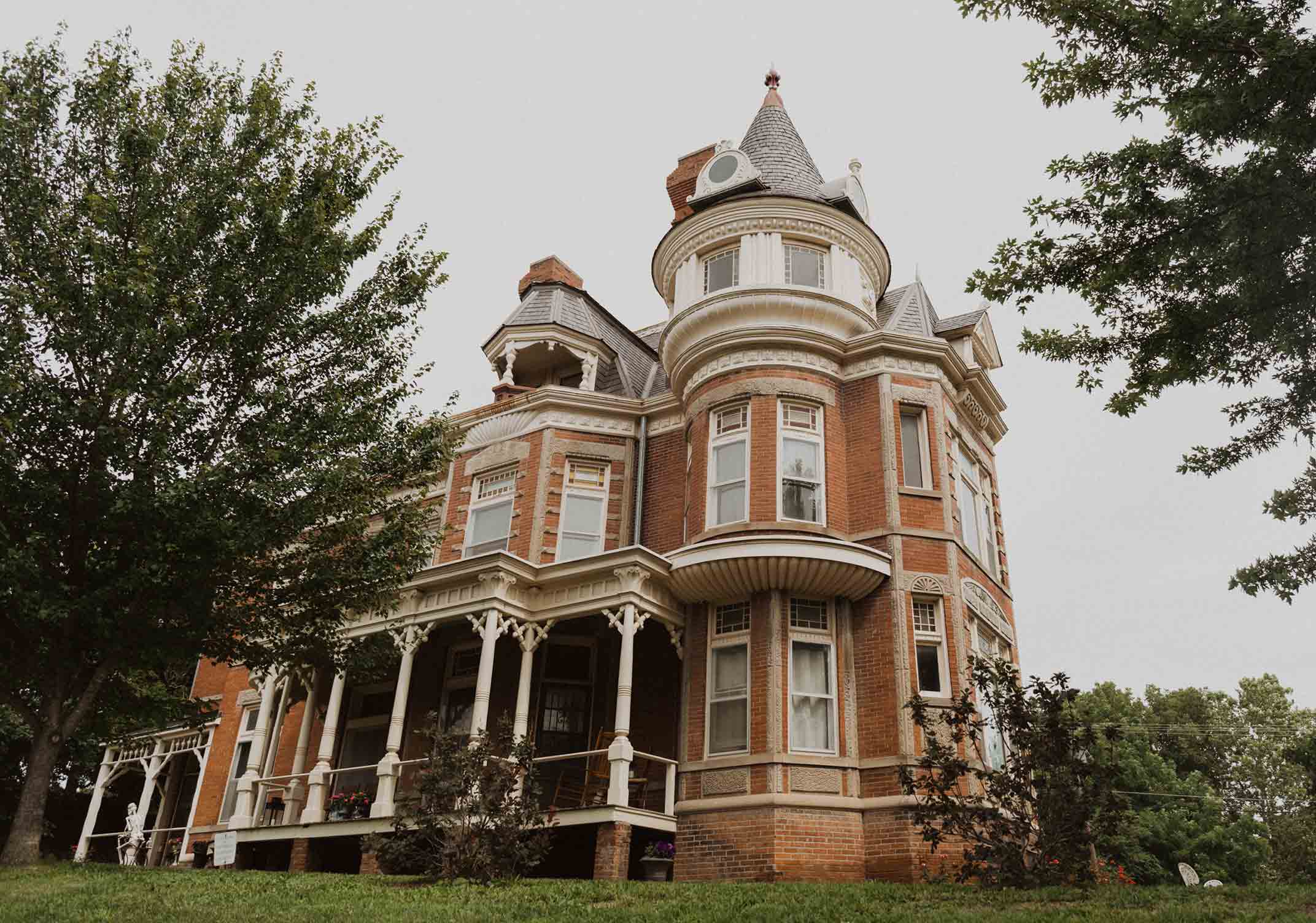
It just so happened that when a young family decided to go searching for a Brookside house with more space, they did not need to look further than a few blocks.
It was the perfect scenario, says interior designer Maureen Lindstrom of the 1947 Brookside house she helped turn into a home for her clients. “They loved their street and neighborhood, and the house they found was the parents’ home of friends of theirs.”
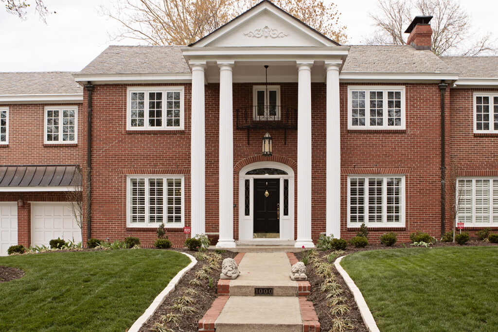
Although the approximately 5,500-square-foot home was just what the new homeowners were looking for, it needed updating. “We basically gutted the whole first floor,” says Lindstrom, who opened her design firm ML Designs in Overland Park about four years ago. Along with tearing down walls and basically constructing a new kitchen, Lindstrom says she focused on creating a space where the family of five could not only entertain but comfortably live their daily lives, too.
“My personal style is transitional,” Lindstrom says. “I like to mix traditional and modern elements; I like it clean with bright pops of color. But I really want my clients to feel at home and to create a space that they truly love.”
Living room
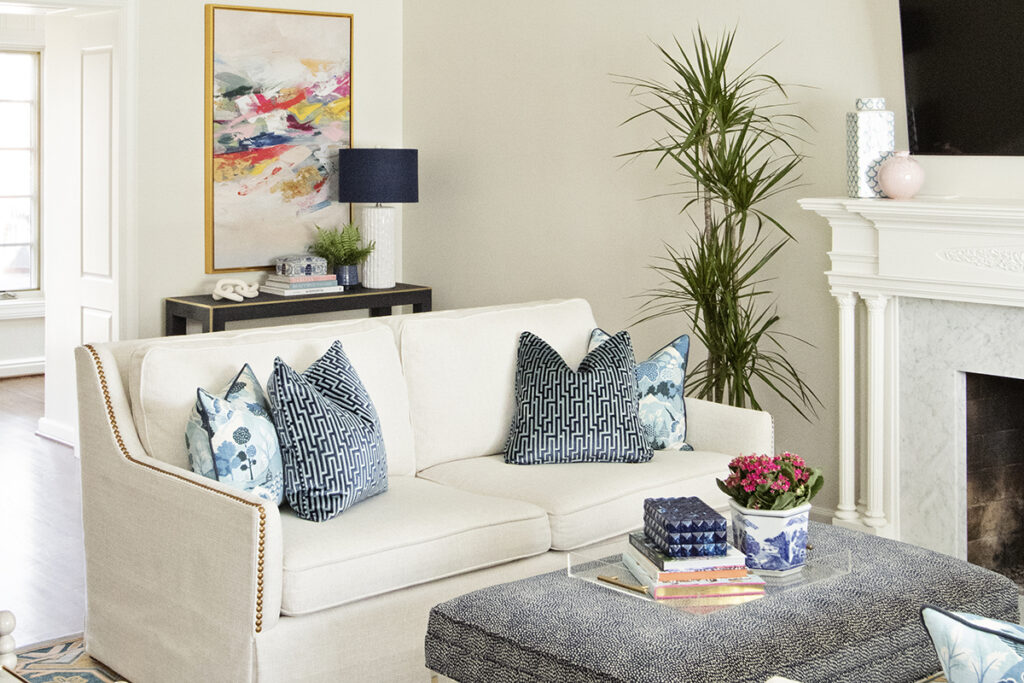
A formal yet playful space, the living room is a mixture of traditional and contemporary, of high and low pieces. Mixing these various elements is what creates an eclectic, sophisticated look, Lindstrom says.
Like the rest of the house, the living room’s foundation is blue and white. Lindstrom used this classic blue and white color palette as a canvas throughout the house and then accented it with bold, bright colors.
Dream kitchen
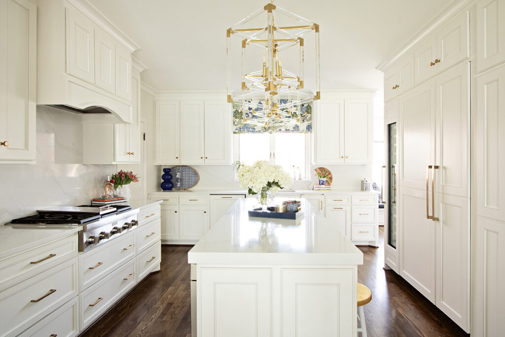
As is often the case with older homes, the original kitchen was small, making day-to-day living and cooking difficult. To create a larger kitchen, Lindstrom took space from the adjacent oversized dining room, opening it up and creating a clean, inviting room that both kids and adults can enjoy.
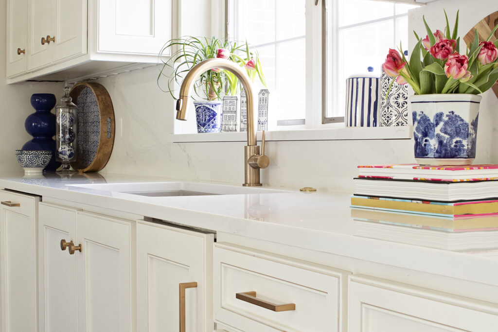
It’s a white-on-white kitchen, with painted white cabinetry and mostly white quartzite counters and backsplash. To add a little glitz, Lindstrom used brass hardware in the kitchen and throughout most of the home.
Powder room
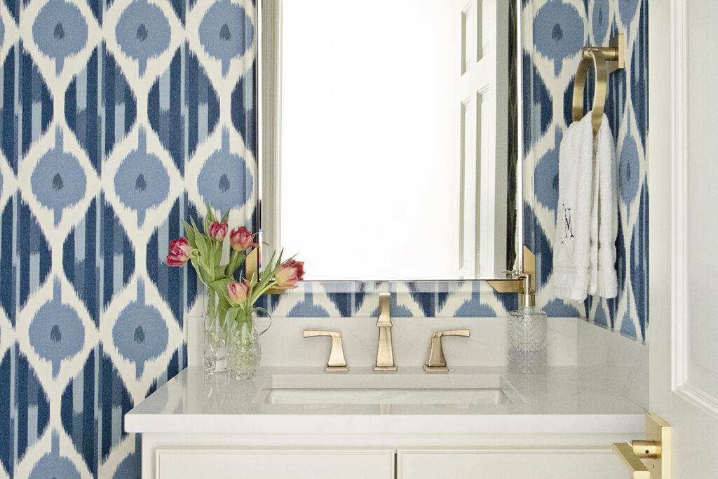
A blue and white ikat wallpaper with abstract print was chosen to line the powder room, creating drama in what otherwise could be a boring little forgotten room. Lindstrom selected bold brass hardware, adding a bit of glam to the space.
Sunroom
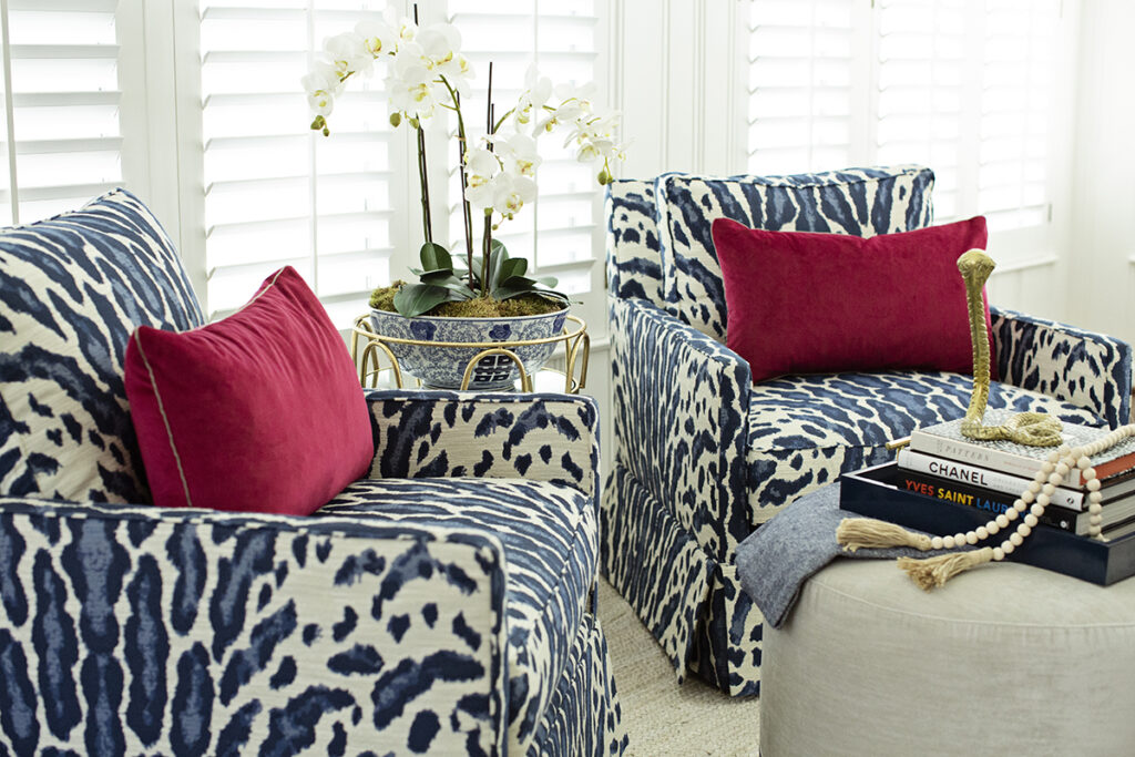
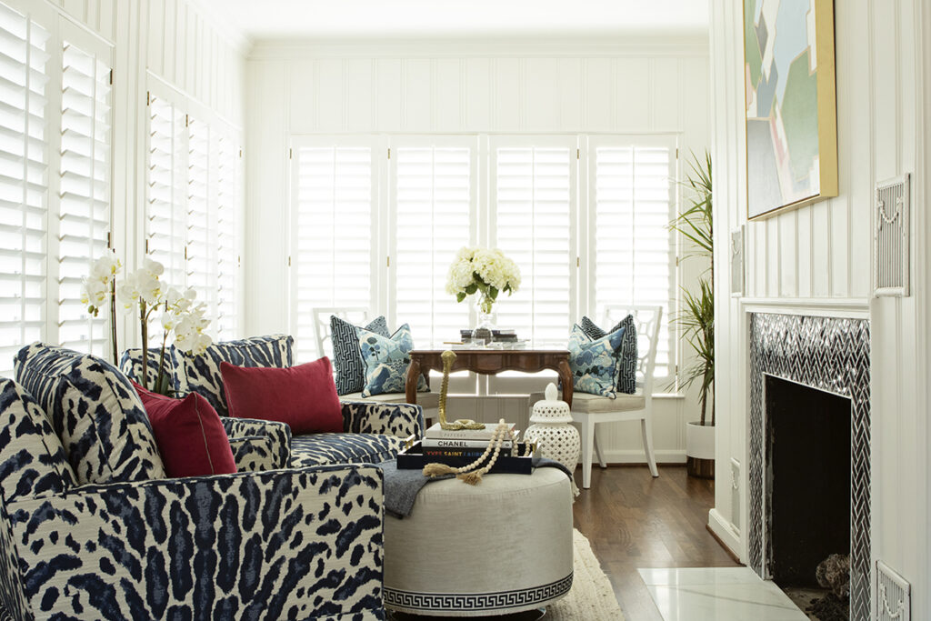
Lindstrom turned a long narrow room that was once designated as a sunroom into a cozy family space by painting the original wood paneling white and accenting the space with unexpected fabric choices, such as blue and white leopard print chairs.
Finishing touches
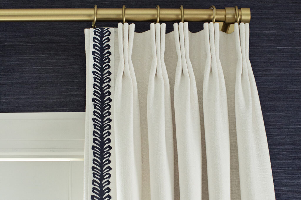
Nothing makes a room feel more “done” than drapes, Lindstrom says, adding that drapes with coordinating colors, fabrics and notions can pull together disparate elements of a room and make the space feel intentional. In the dining room, Lindstrom used crisp white drapes with a dark-blue trim that coordinates with the room’s other blue and white elements, such as the dark-blue grasscloth wallpaper.
Dining room
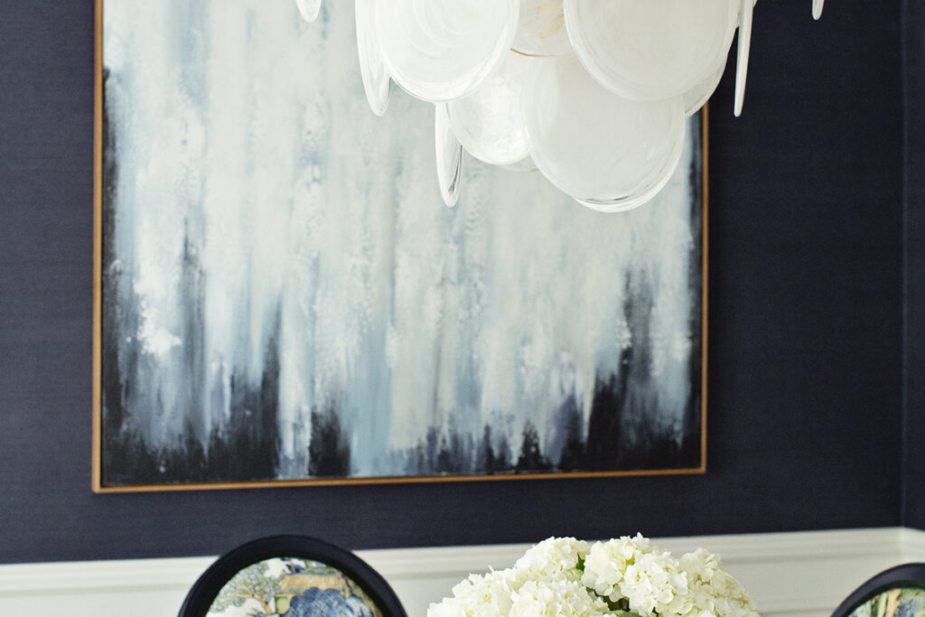
The formal dining room could not be a more perfect example of Lindstrom’s penchant for mixing traditional and contemporary elements. The walls are covered in a navy blue grasscloth, and the room’s wainscotting is painted a crisp white.
Lindstrom repurposed dining chairs the homeowners already had by painting them a dark navy blue and reupholstering them in two different fabrics. A traditional chinoiserie with shades of blue and green was used to back the chairs, and a rich green velvet fabric covers the seat cushions.
The traditional dining table and chairs are juxtaposed with a contemporary white glass chandelier from Visual Comfort that looks more like a piece of modern art than a light fixture.
Bold green bar
Lindstrom reconfigured two small awkward bar areas, turning one into a much-needed coat closet and glamming up the remaining one. She turned the entertaining area into a statement piece by painting the cabinets a “Masters green,” mimicking the iconic green color of the famed Masters Tournament held each year in Augusta, Georgia. A marble tile backsplash with brass inlay finishes off the look.
Stair runner
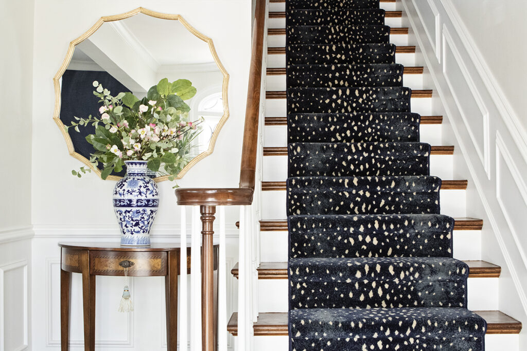
A bold navy and cream animal-esque print stair runner is one of the first design elements that greets you when stepping through the front door and into the home.
“This is one of my favorites,” says Lindstrom, who thinks bold pieces in small doses add flair but are not overwhelming. “An entry way is a guest’s first glimpse into your home.”
In this case, the choice of carpet gives a very traditional staircase a “modern vibe,” Lindstrom says.
Breakfast nook
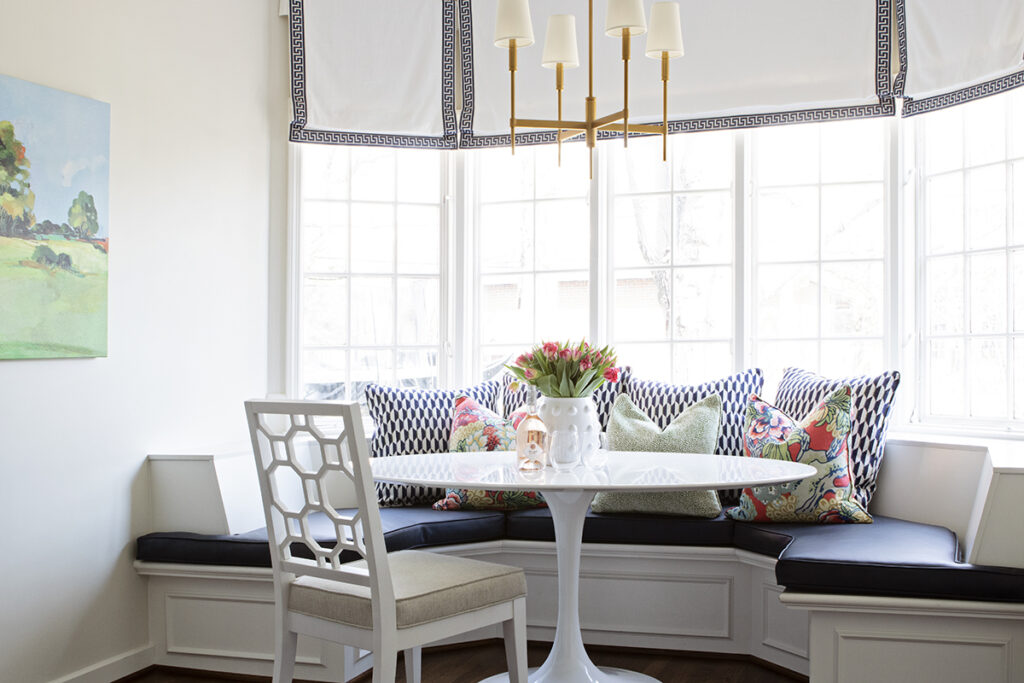
Lindstrom designed a breakfast nook with a traditional built-in banquette off the kitchen, creating a space for eating and talking. To make sure the banquette still felt light and airy, she chose a modern white table and blue and white upholstery.
To add height and drama, Lindstrom had bespoke Roman shades installed near the ceiling rather than just above the window frame.

