Amanda and Brian Baldwin are “outdoorsy” people, so when they set out to build their dream home, they made sure they were surrounded by nature both inside and out.
It began with finding an eight-acre plot with mature trees and a pond in the northern reaches of Kansas City, where multi-acre parcels ideal for building family estates can still be found. Next was constructing their approximately six thousand-square-foot house with large open spaces and floor-to-ceiling windows to let the natural light flow in.
“We love the outdoors and wanted to be able to enjoy it even when we’re inside,” Amanda says. “I love sitting in the living room and just looking out into nature.”
Brian, proprietor of Baldwin Properties and a second-generation builder, designed much of the house himself, from the soaring twenty-six-foot ceiling in the living room to the intimate and rustic lower-level bar. “This home is designed for entertaining and having lots of family fun,” Amanda says.
Although the Baldwins did much of the home design themselves, toward the end, when it came time to pull it all together, they sought the help of interior designer Jennifer Surface of Surface to Surface Interior Design.
“Clearly, Brian is a seasoned builder,” Surface says. “I was impressed by the finishes they (the Baldwins) chose and overall quality. They called upon me to guide the design and decor process.”
Surface worked with the Baldwins to create a contemporary interior with rustic touches. “Having gotten a good feel for the family’s personality and lifestyle, I mixed natural warm colors with bold black and white.”
Much of Surface’s work in the Baldwin’s home was trying to create an overall cohesive look throughout the large and open house. One of the many ways she ties everything together is through paintings, several of which Surface created herself.
“My artwork has to make things flow,” says Surface, who uses colors from the different spaces in her abstract work. “I try to create paintings that I think the family will enjoy and also bring in elements from other rooms.”
Great room

The crown jewel of the home is the great room with large windows that mimic the cathedral-like ceiling, wood truss beams and massive fireplace. The entire room has been painted white with the exception of the natural-colored wood ceiling beams.
Neutral furniture with classic lines form the foundation of the room. Simple patterned throws, pillows and accessories were added by Surface to create layers, complementing the room without overpowering it, Surface says.
Entry

Surface’s bold choices are evident when you first step through the large double doors and into the cavernous entry. Rather than going the more traditional route of soft and muted colors, bold black and white geometric rugs punctuate the floor. Large custom artwork and a massive mirror fill the expansive walls.
“I always try to add a large mirror,” Surface says, specially when she encounters vast empty walls. “Mirrors can add lots of light and dimension to a space.”
Bold shapes also reappear in the entry’s accent furniture: a round table with a cone-like base and a console with three-dimensional gilt doors surrounded by natural wood and a black metal base.
Trophy room

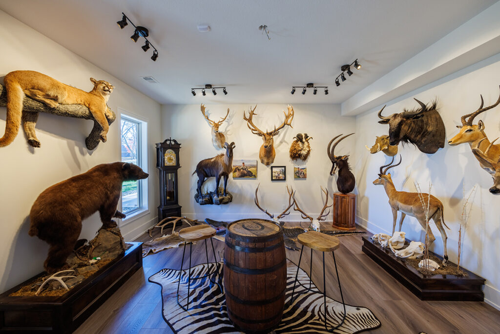
Brian Baldwin is an outdoorsman and bow hunter and has gone on hunting expeditions across the globe. He designed a room off the basement family entertaining area to highlight those adventures, most of which coincide with wildlife management, he says.
The meat from hunts is always given to local villagers when in foreign countries and professionally butchered and given to food banks such as Harvesters when local, Baldwin says.
In the corner stands a Grandmother clock, a family heirloom.
Kitchen

The large living area flows directly into the kitchen. The space is defined by a lower ceiling and large island. The kitchen is another study in combining contemporary elements, as is done with the large island with a quartz top and one waterfall side paired with a rustic natural wood base and support columns on the opposite side.
Old-world choices, such as an oven hood reminiscent of one that could be found in a French country kitchen, are surrounded by clean and contemporary yet classic cabinets.
Butler’s pantry

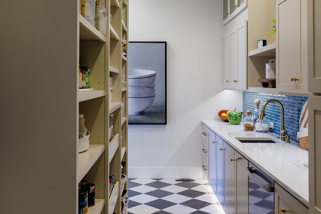
A glimpse of a large and dramatic butler’s pantry and prep kitchen can be seen through open passageways on either side of the kitchen’s anchor wall, creating a space that calls to be explored. A classic black and white floor and a spa green tile black splash were installed, creating visual interest.
The pantry not only provides storage but also serves as a prep kitchen, housing an additional sink, dishwasher and wine refrigerators, along with open shelving and closed cabinets.
“Having a dishwasher and all the storage really helps keep the open kitchen area clean looking,” Amanda says. She says the space makes it easy to hide the messiness that comes with entertaining lots of guests.
Main bath

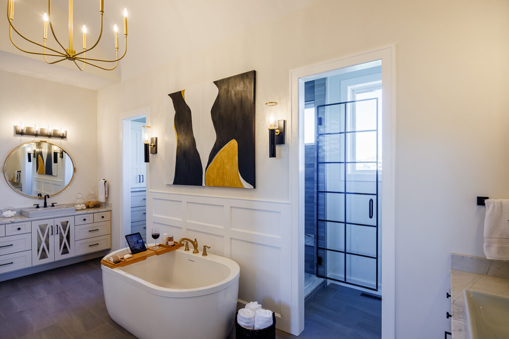
“It’s a very comfortable and calming master bath,” says Amanda, who adds that she’s a “bath girl” and tries to take one most every day.
Another abstract painting by Surface hangs above the deep stand-alone soaking tub.
Surface says she used her painting to create an easy transition from the bathroom to the bedroom, using similar colors.
The master bedroom ceiling relief was designed by Brian Baldwin, and Surface recommended painting it a dark brown to add dimension to the room.
Bar
The Baldwins designed the basement-level bar using bricks to accent one of the walls and a gray and brown veined marble to tie it all together.


