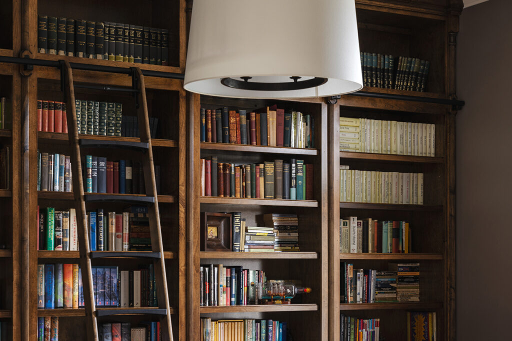
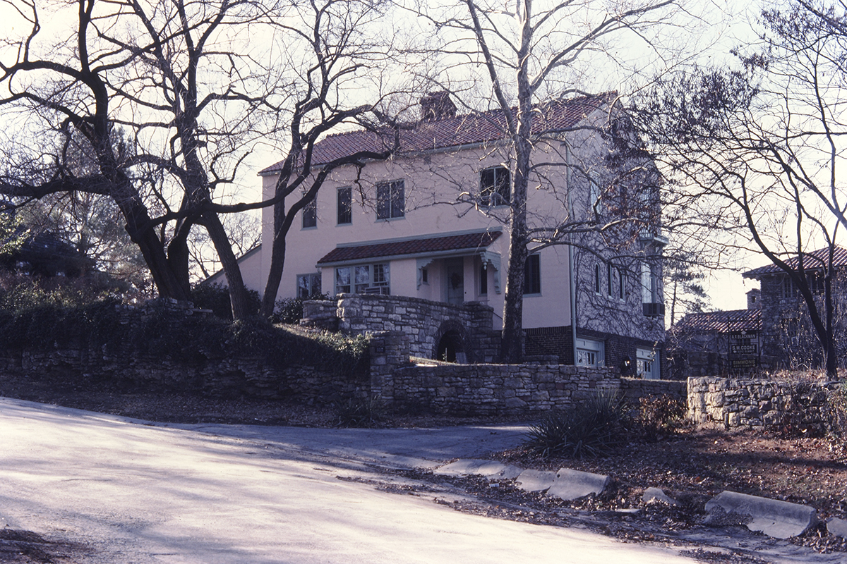
“My clients wanted to make their home feel less formal and more inviting,” says Nina Schmidt of Schloegel Design and Remodel, the firm who handled a complete main-floor overhaul for a late ’90s Leawood home.
Originally the home had ornate molding throughout and it changed from room to room and more formal spaces that were rarely used. “Our clients only got a little use out of their formal living room except for their very spoiled feline,” says Schmidt, who has been working in the design industry for more than a decade. “Overall, the house felt quite formal and a bit dark. Our clients wanted to make it less formal, [more] cozy and inviting.”
Although the footprint of each room remained the same, Schmidt and the homeowners focused heavily on design, including flooring, ceilings, staircases and lighting.
Dream Kitchen
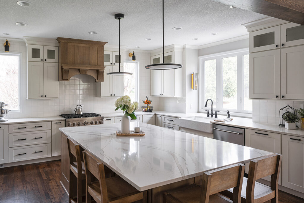
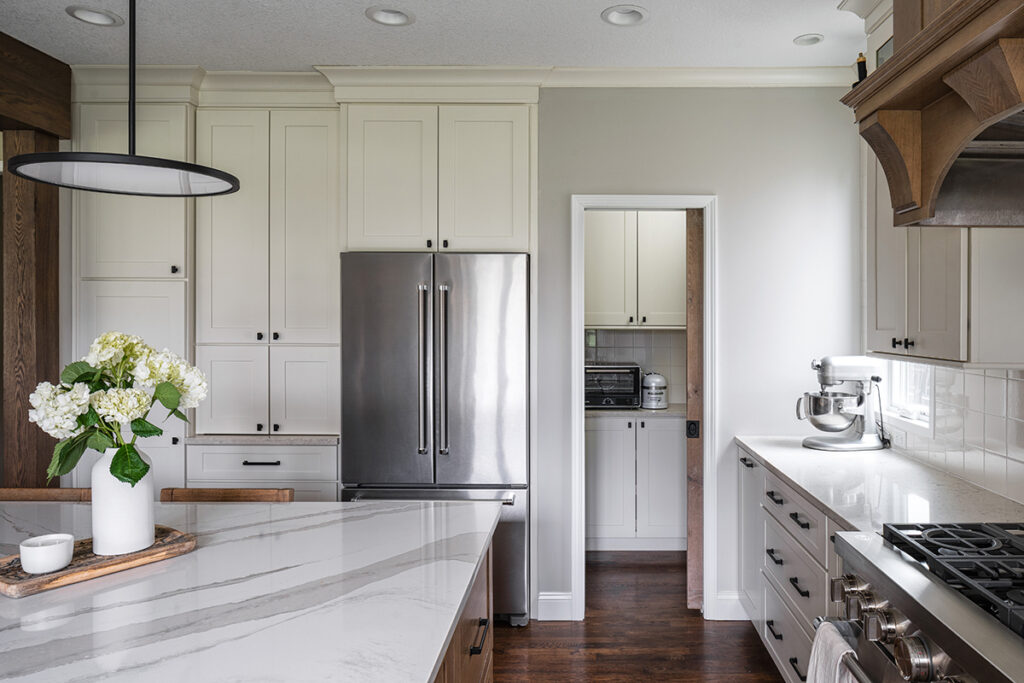
Schmidt transformed the dark kitchen by bathing it in shades of white and then adding a few natural wood elements to keep it warm and inviting.
The original dark wood cabinets were replaced with soft-white cabinets that reach to the ceiling. In contrast to the white cabinets, the island and range hood are a white oak. “It took some time to match the island with the [kitchen] pocket door as well as the beam wrapping the case entry into the kitchen,” Schmidt says. The pocket door hides a walk-in pantry with custom cabinets.
Schmidt and the homeowners worked tirelessly to find the perfect backsplash tile. “So many were too white, cream or had a tint of blue,” Schmidt says. Ultimately, they selected a handmade square tile made by Sonoma Tilemakers.
Staircase
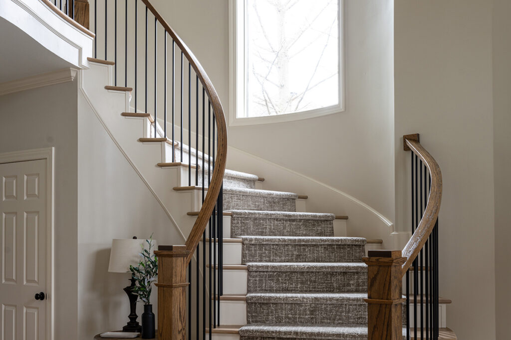
Originally the main entry staircase had carpeted treads, a curved, “snail-style” bottom railing and half-moon-shaped sides on the bottom step. To give the stairs an updated, clean look while still presenting a grand entry, Schmidt switched out the ornate anchor posts, wood spindles and fully carpeted treads with square wood posts, iron spindles and wood treads with a stair runner.
In order to achieve the modern-rustic look and keep the staircase curved, Schmidt brought in expert craftsmen who used mostly hand tools.
Formal Transformation
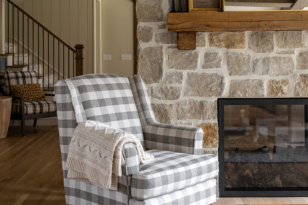
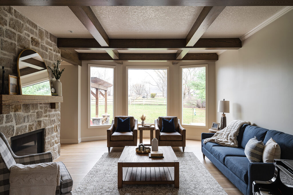
A two-sided fireplace encased by a solid wall separated the formal living room and family room, creating formal spaces not often used. Schmidt decided to keep the fireplace but remove the walls on either side, opening up the living areas. In the process creating a cozy home.
The see-through fireplace was given a facelift with a new rustic wood beam mantle and limestone veneer. “We’re huge fans of how the messy over-grout turned out,” Schmidt says of the limestone work.
The ceilings became a huge focus for this project, Schmidt says. The home’s two living spaces are two different heights. The family room and kitchen have nine-foot ceilings whereas the formal living room’s ceilings were a few feet higher. “[The homeowners] knew they wanted beams, but they decided to do something a bit different on the lower ceilings,” Schmidt says, adding that the beams on the lower ceilings would have made the rooms appear small.
Ultimately, a shiplap ceiling in the family room and a criss-cross beam pattern in the living room were chosen.
Dining Room
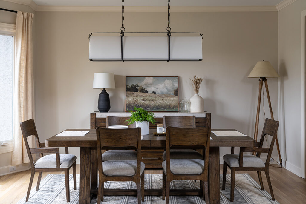
The goal in the dining room was to create a more inviting space, toning down the heavy molding. This was accomplished by removing the half-wall wainscotting, heavy dental crown molding, the tray ceiling and the molding at the cased entry.
Powder Room
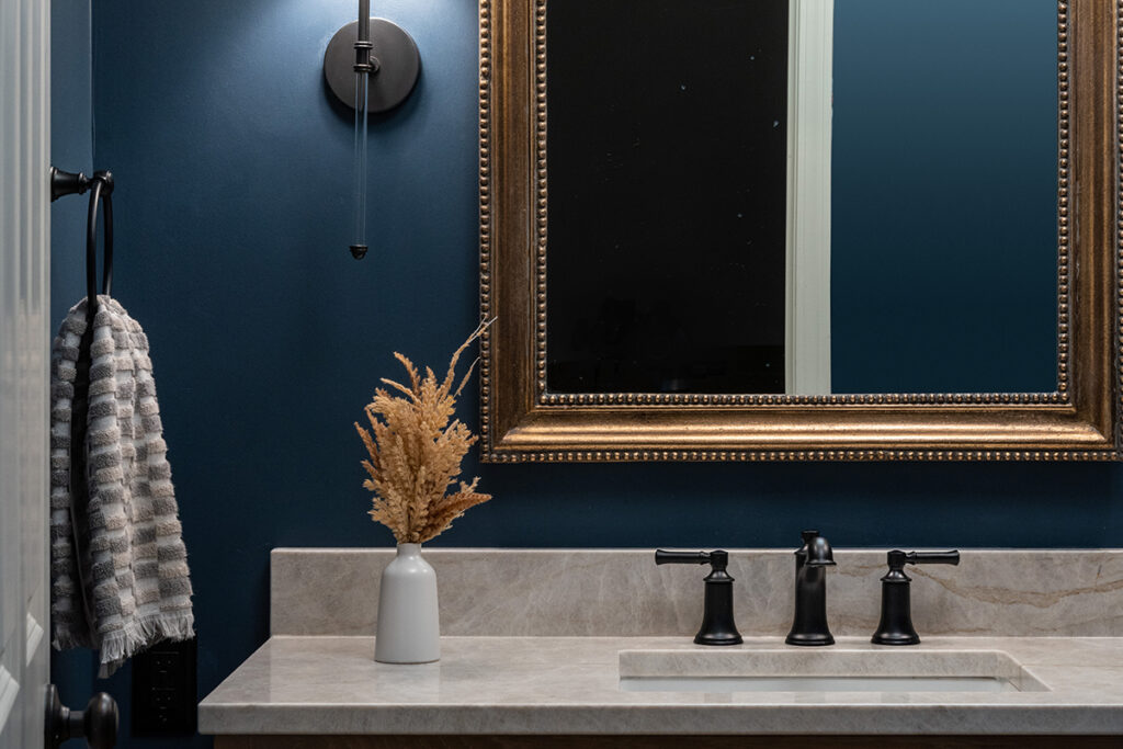
Also overly ornate, the downstairs powder room needed a change and a color pop. “In addition to making it a bit more contemporary, our client wanted the powder room to inject color into the otherwise neutral main floor,” Schmidt says. Ultimately the bathroom was washed in a dusty navy blue and the vanity was replaced with cabinets that mimic the wood colors throughout the rest of the main floor.

