Tina’s inspiration for her home came from two things: rocks and horses.
“I have a thing where I look for heart rocks,” she says. “This place is essentially a rock. I mean, we had to dynamite this place in, which resulted in millions of rocks. I kept finding heart rocks, and I knew it meant something, so that was one of my inspirations.”
Tina is also an avid horseback-lover—she’s ridden since she was young and collects equine-themed art and paraphernalia. Her homestead vision came to life with the help of Laura McCroskey of McCroskey Interiors. McCroskey has been in the design business for twelve years and is known for blending elegance with savvy touches for a high-end, functional product.
“Not all horse paraphernalia and items are Western and rustic,” Tina says. “I have some English pieces, too. If you’re talking about riding English, that style is more Ralph Lauren. Laura helped me blend all my pieces.”
Since Tina spends so much time outside with her horse on the forty acres she shares with her husband, Shannon, McCroskey aimed for everything in the home to be clean and user-friendly.
“We tried to go with a modern look that was still approachable,” McCroskey says. See how she helped Tina blend her affinity for horses—both in decor and in hobby—with modern touches at her home in Spring Hill.
Living Room
The neutral limestone fireplace is the living room’s standout centerpiece, bordered by built-ins on either side that are tightly flushed into the wall by sheetrock. Modern touches, like the iconic statement Platner armchairs, balance out the room’s rustic finishes, like the wood beams and earthy tones.
“If you’re trying to go for a certain look, you have to be mindful to use different materials so that not everything starts to look the same and staged,” McCroskey says. “We’re using old beams, so if you start putting in, say, too many antique-looking furniture pieces, then it starts to look too dated one way.”
Kitchen
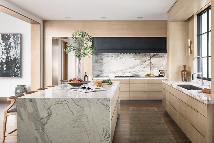
When prospectively scoping McCroskey’s work, Tina fell in love with the designer’s kitchens—specifically one she saw in a model home.
“I’d never seen one quite like it,” Tina says. “It was so unique. It really is the heart of the house.” Now, her own kitchen is her favorite room in her home. When she started working with builder Kirk Cornelius and architect Scott Bickford, she had one request: to be able to see the sunrise and sunset out opposite windows of the kitchen.
“If you look out the kitchen windows, it’s kind of a bird’s-eye-view, kind of a treehouse effect,” she says. “The canvas is always changing. The sky is changing every day. So that’s kind of my art in this space. I wanted the inside of the house neutral so that colors didn’t stop your eye from looking outside.”
The serenity in this kitchen is brought on by the warm, honey-toned white oak cabinets. Behind the cooktop are sliding Carthage Stoneworks marble panels to hide where Tina keeps spices, oils and an iPad full of recipes. Another crucial player in maintaining clean lines is the absence of hardware—all cabinets are equipped with sleek finger pulls.
Office

Shannon’s office is an eclectic mix of rustic and masculine, with different textures and fabrics tastefully brought together by McCroskey’s design eye. Standout pieces include the wall art from Restoration Hardware and a geometric-patterned rug from RugStudio.
“I show clients modern, transitional and traditional fabrics,” she says. “I start getting a handle on what they like. Then I start paring it down to my favorites from those pictures and piles and putting it together with my own design and editing it until it’s, in my mind, beautiful and right.”
Barn
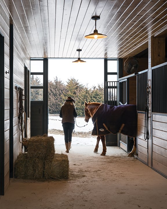
This is the second barn Tina’s had custom-built, so she’s learned a little something along the way when it comes to building materials, maintaining, feed rooms and more. The barn is built under the ground and therefore is warmer for her horse. McCroskey helped Tina pick out the stain colors, as Tina “didn’t want your standard barn or you walk in and it’s pine-colored.”
“[When designing a barn], it really depends on your riding discipline,” Tina says. “I’m older, and I don’t want to breed a mare. I don’t want stallions. I just want to ride a little gelding out in the pasture and have some fun.”
Tack Room
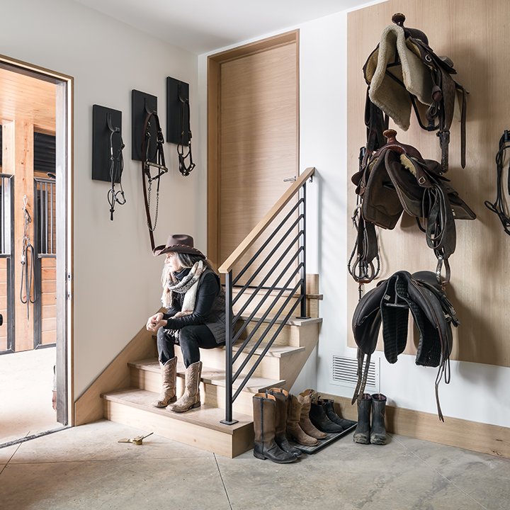
The tack room is where Tina displays not only saddles she’s currently using but also saddles that she’s retired and is keeping for memory’s sake. “When you ride thirty years in one saddle, you want to keep it,” she says. She has different saddles for different uses: a cutting saddle, a ranch saddle and a saddle for riding the creek, just to name a few.
Mudroom
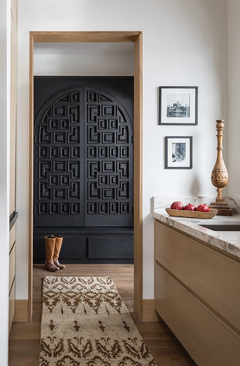
The mudroom cabinet doors were inherited from a friend of Tina’s and were originally sourced in Mexico.“These were hand-carved,” she says. “I had those doors leaned up against the wall of my home. I always thought, ‘If I ever build another house, I’m building these in somewhere.’ So I put them here.”
Powder Bathroom
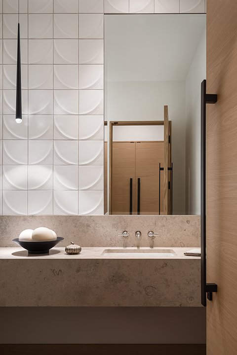
The floating vanity in this powder room made by Carthage Stoneworks is a Tuscan-style marble and balances out the room’s modern fixtures, like the floating pendants and the Ann Sacks ivory modern moon tile.


